Location: Belfast
Date: January 25, 2024
This week’s research task asked us to photograph a wide selection of typography and lettering examples which illustrated the identity of our hometown or nearest city. We were asked to collect a broad range of samples before editing the collection down to 5 examples.
Being completely honest, my hometown of Carrickfergus is not particularly diverse in terms of typography and lettering. As a result, I decided that Belfast would be a better location for the task.
Historically, signage, lettering and typography has often been divisive in Belfast; marking out territories and excluding people from one side or other of the sectarian/religious divide. However, when you look beyond that, the lettering of the city provides a very real and accurate narrative for the history of the city and indeed, where it is in terms of development today.
In coming to terms with a legacy of conflict, Belfast is becoming a city which is developing and regenerating. Many of its older buildings have been repurposed but when you look closely the old signs are still there of Belfast’s rich history – a history of not only conflict but of industry, knowledge, the arts and re-invention.
Location 1 – Pat’s Bar, Sailortown, Belfast


Considered one of the oldest bars in Belfast, Pat’s Bar, which now stands derelict, traded under one name or another since the late 1800s. In the heart of the dockland area of Belfast known as Sailortown, the old railways lines which served the docks are visible on the still cobbled streets. The bar lay at the heart of the working-class dockland community. However, it also catered to the transient population of sailors who came and went from the docklands area. It survived the re-development of the 1960s/70s to host a “melting pot” (Deighan, 2019) of clients during The Troubles. During this time many of those living in the local community were rehoused in tower blocks and housing further out of the city-centre, so the land could be re-purposed for commercial use.
The hand-painted signage is faded and flaking over the doors which closed for the last time in the early 2000s. The Brennan coat of arms (owner’s surname) still hangs proudly. Some attempts have been made by the small, local community to keep the memories of the area’s maritime history alive by decorating the boarded-up windows.
Location 2 – University of Ulster, Belfast Campus, Cathedral Quarter


The University of Ulster has 4 main campuses across Northern Ireland – 3 on more rural sites and 1 in Belfast. The Belfast campus which is described as lying in the artistic and cultural centre of the city, has traditionally been associated with art and design. However, recent expansion in the city’s campus has resulted in it becoming home to the university’s computing, engineering, business, politics, policy, law, communication, sports, architecture, hospitality, event management faculties.
It is hoped that the new campus will bring social and economic recovery to an area of Belfast which has been struggling both socially and financially. Considering the personality of the University as the key driving force behind its success, it has focused on a developing branding which is confident, clean and contemporary. This is evident in the signage for the university and the way it uses typography. The lettering is clear, bold and easy to read and the metallic tones add the impression of strength to it. However, integrated into that it the very elegant and graceful “U” symbol.
I have included a link to their branding PDF below.
Location 3 – Liv Student Accommodation, Belfast, Cathedral Quarter

The expansion of the Ulster University campus in Belfast has brought with it the construction of new student accommodation by companies specialising in that field. This logo and lettering is for one such block of student accommodation built by Liv Student – a subsidiary of the Spanish company, Valeo Groupe. The company is represented by the “V” in the logo. Overall, the logo and lettering are modern and practical, if not particularly inspiring. In saying that however, I am not entirely sure it needs to be. Student accommodation needs to be functional rather than luxurious. It serves that purpose well.
Interestingly, the building of student accommodation in this area of Belfast has encountered opposition. It is an area which historically has struggled both economically and socially and both residents and some councillors maintained that the priority in the area should have been for social housing over student accommodation.
Location 4 – Sunflower Bar, Union Street, Belfast


Although the Sunflower Bar only opened in 2012, a selection of public bars had stood on this site since the late 1800s. Situated behind Belfast Central Library, and lying close to newspaper offices such as The Belfast Telegraph, The Irish News, The Newsletter and The Northern Whig, the pub had historically been a favourite haunt of journalists, writers and artists in the past. Playing daily live music it continues to be frequented by journalists, musicians and students today.
In a precarious location, it was frequently damaged throughout The Troubles, with the metal cage being a throw-back to the 1970s/80s, when many pubs in Belfast would have security grilles at their entrances, as well as on their windows.
The white lettering painted on the boarded-up windows on the third or attic floor of the pub was a common feature of businesses in Belfast, presumably acting as a form of advertising because it would stand out higher than the rooftops of surrounding buildings. The signage and lettering quite simple, lending very much to the feel of the local corner pub which is familiar and comfortable. The yellow and green tones tie in with the sunflower feel.
I love the sign outside which reads “no topless sunbathing…”. Actually taken from graffiti which was originally found on a nearby wall, it illustrates perfectly the tendency of Northern Irish people to not take themselves to seriously.

Interesting also are the signs which ask customers to leave quietly because it is a residential area.
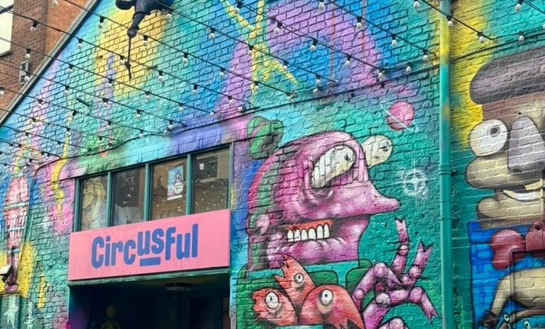
Location 6 – Street Art, Cathedral Quarter, Belfast


Location 7 – Belfast Telegraph Offices, Royal Avenue, Belfast


Historically, this area of Belfast had a proliferation of newspaper offices and it is actually very sad to see that one by one, they have gradually disappeared. This building housed not only the offices of The Belfast Telegraph, it was printed and distributed from this building as well. In the first two pictures the original inscription of the telegraph can be seen, as well as a plaque showing it as the registered offices of the paper. The signage in the third picture, bearing the paper’s font in gold, appears to have been added in a later date.
Both the gold lettering and the plaque signify the importance of the paper historically. Before telephones, the paper was a vital source information for people in the city notifying births, deaths, marriages etc. It was even used to convey the status of very sick patients in the city’s fever hospital who were not allowed visitors.
It is very sad to see the building lie empty today. With printing streamlined, its doors closed in 2015, with publication moving to a smaller site in Newry. The building is used today for live music gigs for small and upcoming artists.
Location 8 – Edwards & Co Solicitors, Cathedral Quarter, Belfast


This solicitor’s office was hidden away in Belfast’s artsy Cathedral Quarter and its typography caught my attention. Blending with the pubs, restaurants and hotels in the early while also standing out in its own right was a undoubtedly a difficult balance for the company to strike. However, it managed to do so really well. It’s lettering and older style font matched that of the buildings around it, giving it a confident, sophisticated, established feel. However, the softness of the “&” and “e” (left) above the company name, added a personal and contemporary feel.
Location 9 – Duke of York Pub, Cathedral Quarter, Belfast


From the outset, I should say that the signage on this Belfast pub is a little bit confusing, with the actual name of the pub itself being very difficult to find. You can get a small glimpse of it in image one and I will admit that I had to look later at several pictures online until I found the actual sign bearing its name, The Duke of York (see below).
Does it matter that you cannot see the sign bearing the name of the pub? I am not sure it does because the pub is very well known by the people in Belfast regardless. The quirky, chaotic signage on the exterior of the pub may not be to everyone’s taste but it reflects the personality of the pub and its colourful history. Like the other pubs above, it has stood in Belfast for well over 100 hundred years. However, the pub’s owner Willie Jack comments, “The thing about the history of the Duke of York is that nobody can agree on what’s true, and we are not here to help. The only way to know what it’s like is to come and experience it yourself”. All the signs and sayings displayed on both the interior and exterior have been collected over the years from not only Belfast but from all over the 9 counties of Ulster. The pub’s eclectic exterior shows that everyone is welcome there with only one condition – you respect other drinkers and staff. Indeed, the pub has a famous saying, “Come in Soberly, Drink Moderately, Depart Quietly and Call Again”.

The sign is a little more obscured now.
Location 10 – Merchant Hotel, Cathedral Quarter, Belfast

It was quite difficult to get a picture of the signage on the front of this building and unfortunately, this one does not do full justice to the intricate design of the building itself. The Merchant Hotel is one of Belfast’s five star hotels. It was purpose-built in the late 19th century as the headquarters of the Ulster Bank. The site in Waring Street was suited because at that time it was the mercantile and commercial centre of the city. Local design studio Paperjam was responsible for branding of the hotel which opened in 2006. They explain that when consulted about names for the hotel, the mercantile history of the area had been central in their minds – hence the decision to name the hotel, The Merchant. The signage and typography featured on the hotel’s exterior is closely connected to its exquisite architecture, with Paperjam having created its own unique typeface called Début. I have included the link for the design studio below.
https://paperjamdesign.com/portfolio/the-merchant-hotel/
Location 11 – St Malachy’s Old School Coffee House and Skinworks Tattoo Studio, Oxford Street, Belfast


This quaint little building is found in Belfast’s Oxford Street, close to both the Laganside Courts and the Royal Courts of Justice. Originally opened it 1874 as St Malachy’s Catholic Boys’ primary school, its name is still etched around its ecclesiastical door. Today, it is home to Skinworks Belfast tattoo parlour and Malachy’s Old School Coffee House.
Although the monotone signage for the tattoo parlour is quite modern, I feel it fits in really well with the Gothic feel of the building itself. Bearing the Belfast coat of arms, creates a connection with the city’s past and its present. Similarly, the signage for the coffee house gives a nod to the building’s past with an image of St. Malachy – the patron saint of the Archdiocese of Armagh and the Diocese of Down and Connor. The lettering on the coffee house signage is characteristic of an Irish or Gaelic typeface, which also ties in to the history of the schoolhouse which was run by the Irish Christian Brothers’ order.
Location 12 – St Georges Market, The Markets, Belfast

St George’s Market, which opened in 1896, is one of the last surviving Victorian covered markets in Northern Ireland. As well as bearing its name, its four stone arches include inscriptions in both Latin and Irish giving it a sense of importance and permanence. It was and remains an example of typical Victorian style, utilitarian architecture. The typeface used with bold, functional and easily read – it had a Victorian charm but was quite practical as well. During the Belfast Blitz in 1941 it acted as an emergency mortuary before returning to its everyday business as market. For a short period in the 1980s, there were doubts about its future due to increasing maintenance costs and the imposition of new hygiene legislation. However, both Belfast City Council and Heritage Lottery Fund supported a refurbishment programme to save and upgrade it.
Location 13 – Telephone House, Cromac Street, Belfast

To look at this building now, it is perhaps difficult to understand the excitement it caused when it was opened in 1935. An excerpt from the Northern Whig newspaper in March 1935 described it as “modernistic embryo skyscraper, towering above the Belfast rooftops”. With a slight hint of an art deco style, the building was set to house one of the world’s most up-to-date automatic telephone exchanges. Today, the building has been dwarfed by taller buildings and feels somewhat unremarkable in appearance. It is only really when you take time to stop and really look at it that you actually appreciate it as an impressive piece of architecture.
Bearing the same Belfast coat of arms as that of St George’s Market and the Merchant Hotel, the design here is much less intricate. The lettering made out of metal, is quite simple and functional in appearance.
The building is still owned by BT today.
Location 14 – BBC Broadcasting House, Belfast


BBC Broadcasting House stands close to the centre of Belfast. It was built in the late 30s/early 40s and like Telephone House has echoes of the art-deco style of architecture. It is not very clear to see from the picture but it “The British Broadcasting Corporation” inscribed over the front door, while the current BBC logo is displayed on both sides of the left, upper corner on the building. On the day this photograph was taken, it was missing a letter “B” on the front, following stormy weather in the days before. If you look closely, two plaques bearing the current logo can also be seen on the pillars outside the front door.
At eye-level the identity of the building is quite conspicuous but the iconic BBC logo, as well as masts and satellite dishes on the roof, reveal its purpose. The importance of the building and its connection to the nationwide and indeed, worldwide service stands out clearly from the logo.
Location 15 – Robinson and Cleaver Building, Donegall Place, Belfast

This, to me, is one of the saddest buildings right in the heart of Belfast City Centre. Having shut down as one of a small number of Belfast’s own luxury department stores in the 1980s, it was divided into a number of smaller units with the main occupiers being first Wimpy and then, Burger King. While the units on either side of this are currently in use, this one closed some time ago and remains empty.
The Robinson and Cleaver signage is still evident above what would have been the front doors of the store. Indeed, I did not realise at the time but if you look to the very top of the building, the stores name is also spelled out in brick work. Recently, a luxury wine bar has some success in one of the units on the upper floor but it would be lovely to see the whole building restored to its former glory.
Location 16 – Mast Sculptures, Donegall Place, Belfast


Historically, Royal Avenue and Donegall Place had been Belfast’s main shopping area, boasting a mix of High Street retailers and homegrown department stores. It suffered a great deal during the Troubles with the area being almost entirely pedestrianised due to the widespread use of car bombs.
Regeneration brought investors to Belfast leading to the development of Castle Court shopping mall in 1988 and the luxury, Victoria Square in 2008. Unfortunately this drew shoppers away from Belfast city centre leaving it in need of investment and regeneration.
The regeneration programme saw the erection of these 8 bronze sculptures in Donegall Place. Representing ships’ masts, they each bear the name of ships built in Belfast for the White Star Line with the most famous The Titanic being closest to the City Hall. These masts celebrate Belfast’s maritime history, as well as its role in the tragic history of The Titanic
Illuminated at night, each mast and its lettering are made of copper which eventually turn green to match the dome of Belfast’s City Hall. The name of each ship is bolted to the mast in a way which represents the lettering of the ships.
The city of Belfast has faced many challenges socially, politically and economically and it has become really quite accustomed to having to re-group, reorganise, repurpose and regenerate. It is a city with a rich cultural history and it is a city that in moving forward, does not want to leave that history behind. It is a city which is adept at repurposing its beautiful, older buildings and incorporating both their history and their characteristics into the future of the city. Above all, it is a city which has an exciting future ahead.
Sources:
Deighan, E. (2019). Big plans revealed for Belfast’s Rotterdam and Pat’s Bar sites. Available at: https://www.belfasttelegraph.co.uk/business/food-drink-hospitality/big-plans-revealed-for-belfasts-rotterdam-and-pats-bar-sites/37980894.html. (Accessed on: 25 Jan 2024),

Leave a comment